Range USA Logo Design
As part of a comprehensive company rebrand, I led the logo redesign for Range USA, transitioning the brand from its former identity as Shoot Point Blank. The objective was to create a bold, modern visual identity that conveyed industry expertise and trustworthiness.
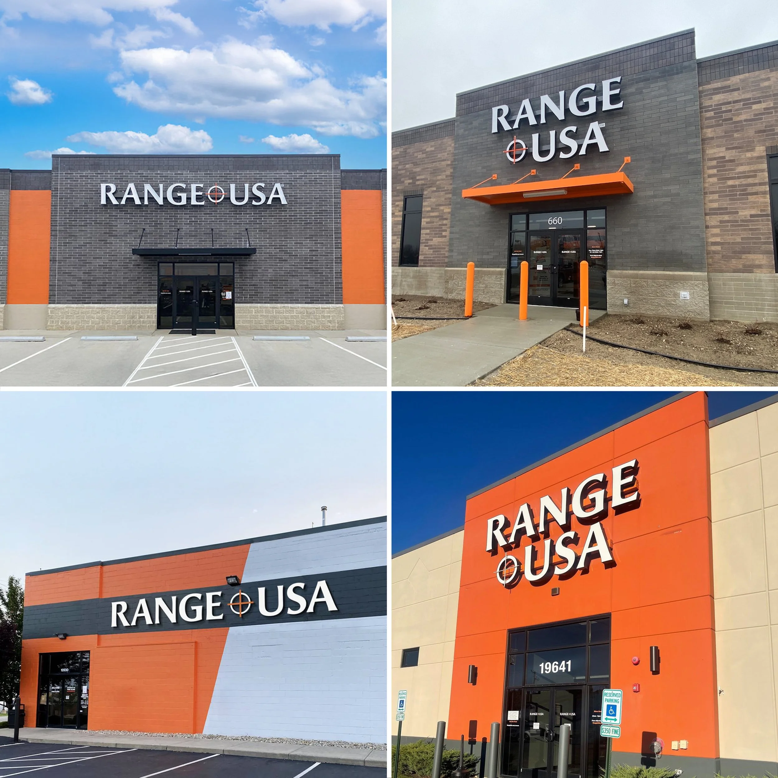
The process began with curating a set of fonts and colors that aligned with these values. Angie Sans was selected as the primary typeface due to its subtle serif characteristics, which helped convey credibility and knowledge while maintaining a contemporary, hybrid serif/sans-serif appearance.
Multiple logo concepts were developed, some incorporating visual nods to the stripes of the American flag and abstract inspiration from firing range lanes. A dark blue was initially considered as a primary color due to its strong association with trust and security—attributes commonly leveraged by financial and institutional brands. However, the final decision was to retain the existing orange and dark gray color palette to minimize the cost of rebranding over 40 store locations.
During the review phase, feedback from the Owner and CMO indicated that the “G” in Range resembled a “C.” To resolve this, an arm was added to the counter of the letter, improving legibility.
Following additional consultations with investors, it was determined that including an American flag motif was redundant given the company name already featured “USA.” As a result, the flag element was replaced with a bold crosshair design in the brand’s signature orange, reinforcing the shooting range identity.
Finally, a secondary stacked version of the logo was developed upon request to accommodate various storefront signage applications.